
INFINIT App Redesign
I redesigned the overall mood and tone of the INFINIT App for its Beta launch, introducing a new design system and simplifying the interface to be more user-friendly than the Alpha version. The update improves usability and overall user experience, with a refined color palette that meets accessibility standards. Complex DeFi and AI concepts are translated into an intuitive and approachable interface.
Scope
DeFi Application Redesign
Platform
Desktop/Mobile
Team
Petchpeth (Me) - UI and Design System Designer
Kritika Nillawong - UX UI Designer
Arin Trongsantipong - Product Manager
Role and Responsibilities
Led the redesign of the product’s visual direction and interface to make it clearer and more user-friendly.
Did competitor analysis and joined strategic discussions for the Beta launch.
Worked closely with the UX Designer and Product Manager, iterating back and forth to find the best solutions within tight timelines.
Defined and analyzed user personas to better understand our target users and design for their needs
The Challenge
As a Web3 DeFi startup, our approach to testing and validating our idea was to launch our MVP, a first version of the product that included everything we thought users would need.
However, after launching, the feedback we received from the community, stakeholders, and investors hit hard. The overwhelming response was that the product was too complex and information-heavy, making it difficult for users to skim and understand quickly leading to significant drop-off.
The challenge was clear: we needed to make the experience more accessible and user-friendly, reduce drop-off rates, and find ways to help users successfully complete their key activities.
The Process
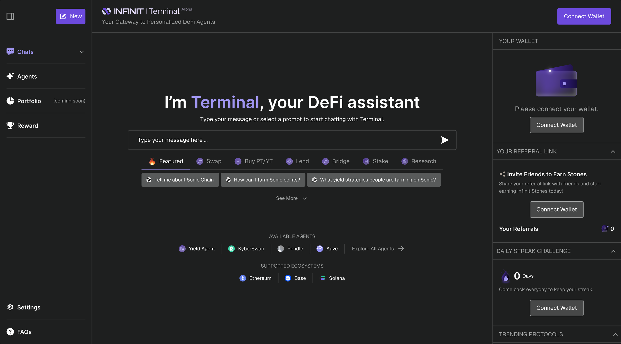
Our internal team held a series of brainstorming sessions to validate the feedback patterns and identify the root causes. Looking at the original interface, it became clear why users were struggling: the layout was pulling attention in too many directions at once. A chat interface, a wallet panel, referral links, daily streak challenges, trending protocols, and agent shortcuts all competing for space on a single screen. For someone new to DeFi, it felt overwhelming before they even typed their first message.
During our internal brainstorming session, we faced a clear tension between two directions. One was a simple, clean, and easy-to-read interface, minimal, light, and familiar, similar to tools like ChatGPT or Grok. The other direction was more bold and distinctive, darker, more expressive, with strong personality and unique visual details.
The challenge was that these two directions don’t really work together. If we go simple, we need to reduce visual noise. If we go bold, we need to lean into strong visuals. Trying to do both at the same time just makes the product feel confusing and unfocused, like going left and right at once.
As I said during the session, We want everything, but wanting both things at once is like turning left and right simultaneously.
The real issue here is a common product trap, trying to be everything for everyone. When that happens, the product ends up unclear. It’s not simple enough for new users, and not distinctive enough to stand out.
So the real challenge wasn’t just about visuals, it was about making a clear decision. Choose one direction, commit to it, and then add details that support that direction instead of fighting it.
If we go simple, make it feel effortless and smooth. If we go bold, go all in and make it memorable.
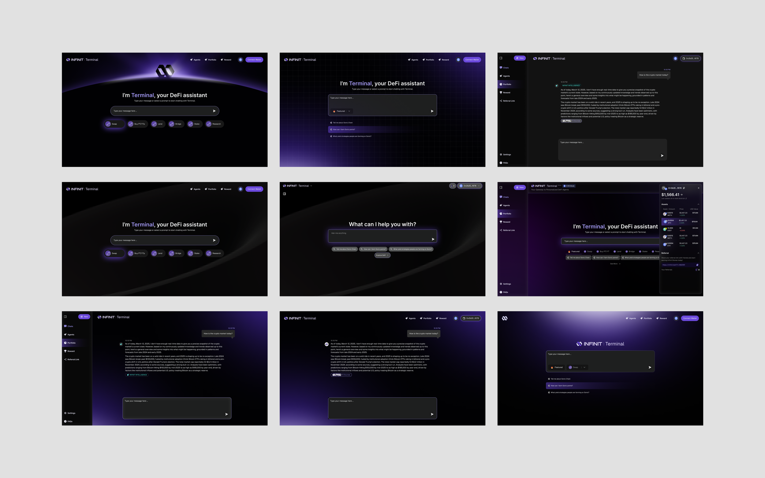
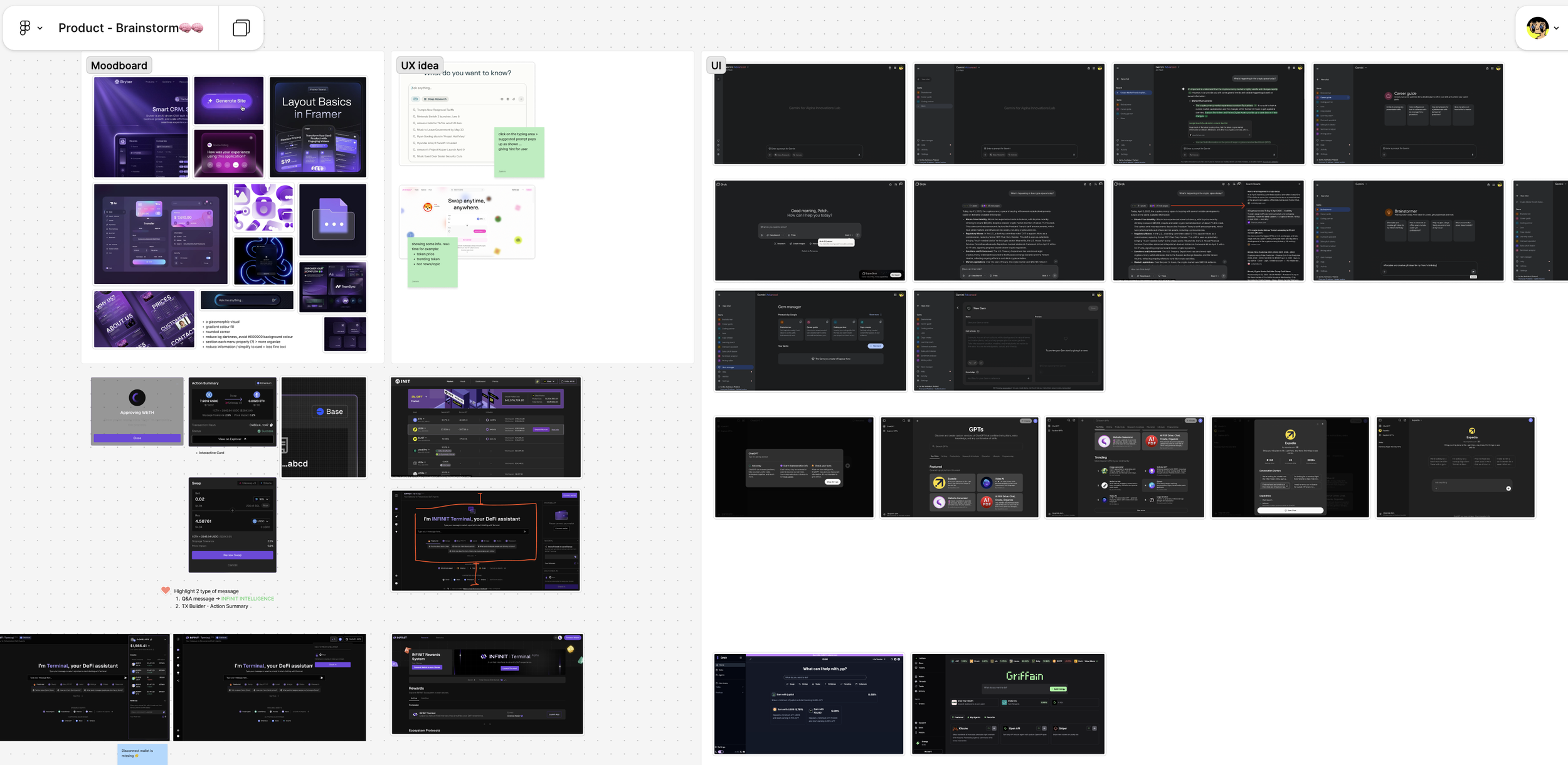
After our discussion, I started iterating on new interface directions while keeping the same color palette. During testing, I realized the UI still felt too dark and overwhelming. Staring at it for a while caused eye strain, and the contrast was too strong, making users not want to stay on the page for long.
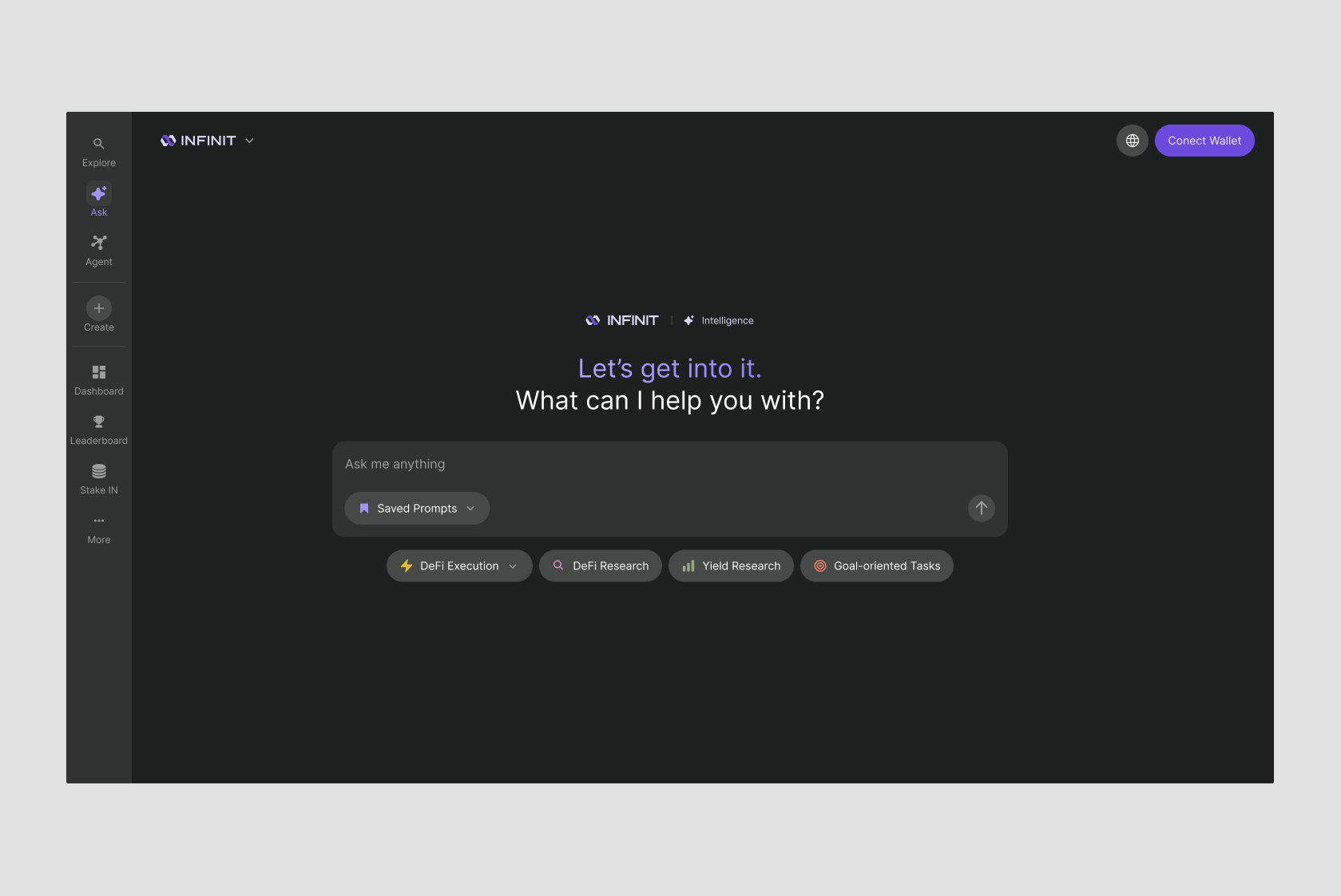
I explored several directions after researching AI chat patterns. I proposed simplifying the interface to make users feel comfortable from their very first interaction. After discussion, the team aligned on this direction.
The UX Designer revisited and refined the user flow, while I focused on designing the new interface. We worked closely together, going back and forth on design iterations to achieve the best possible outcome. In the end, we met in the middle, combining the improved flow with the new visual direction. The UX Designer applied the updated theme and integrated the new interface into the refined user flow.
The Result
The Beta Launch
I would say this was one of the most successful launches for our team. After aligning across all aspects, everyone played an important role. As the Lead UI and Visual Designer, I focused on finding the right solutions and simplifying complex ideas into a more user-friendly product. The UX Designer worked hard to design new flows for a new kind of experience in the DeFi space. The tech team ensured secure transactions and managed the agents to support our users. The business team connected closely with the community, investors, and partners.
Kudos to everyone, this wouldn’t have been possible without the whole team.
The Impact
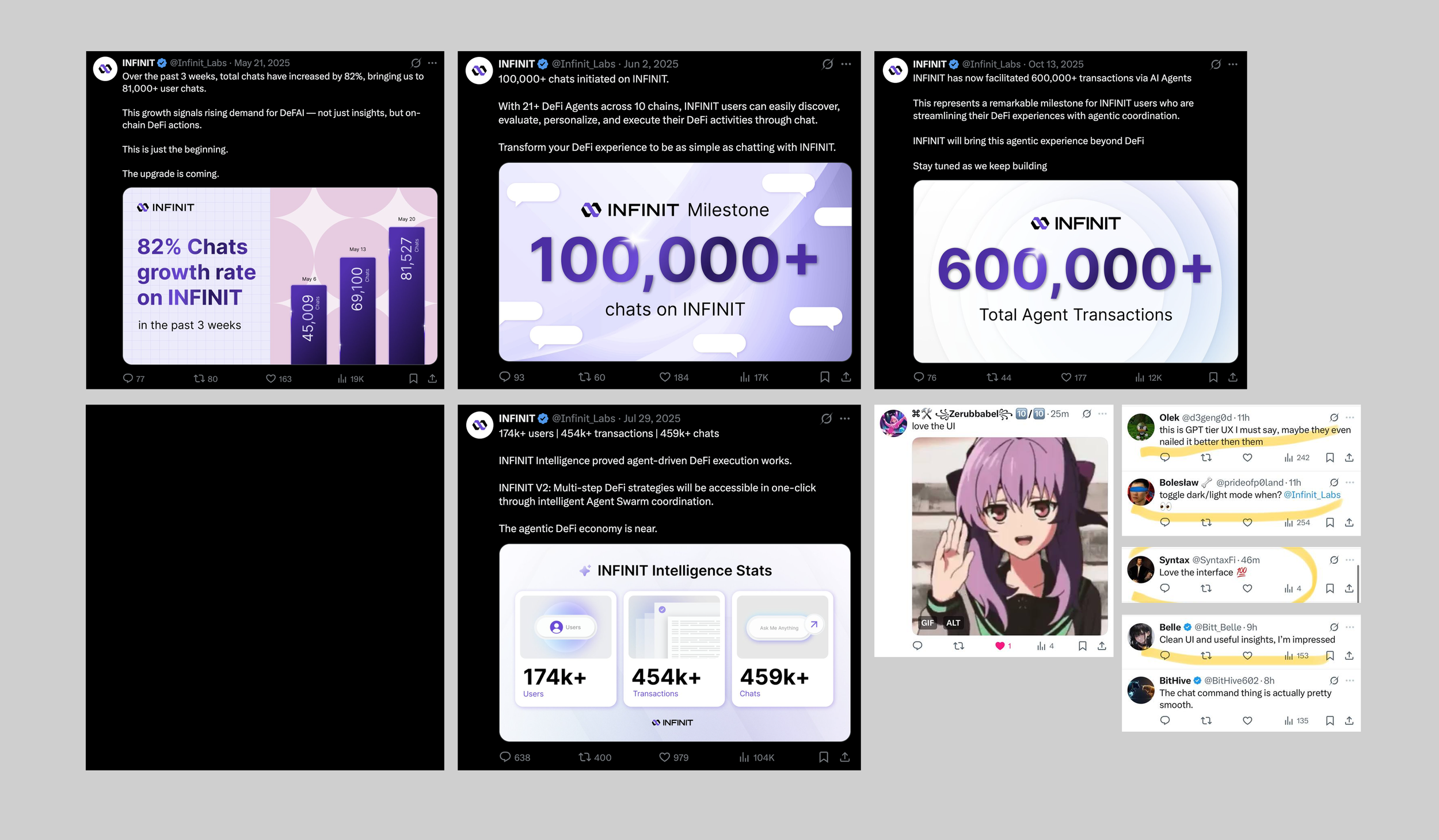
82%
chat growth on INFINIT over the past 3 weeks after launch, and we’re still growing from May to July, reaching 459,000+ chats.
174K+
users within 2 months of launch.
600K
Total Agent Transactions on October
Beyond the metrics above, we received a lot of positive feedback on the UI design.
The Next steps
After this launch, we developed our next core feature, “INFINIT Strategies,” which helps users generate yield easily by following the strategies we provide. This was easier to build thanks to the strong foundation of our design system, which allows the product to scale across multiple features.